Mastering Color in Design
Dec.2023
Read Article
↓
↓

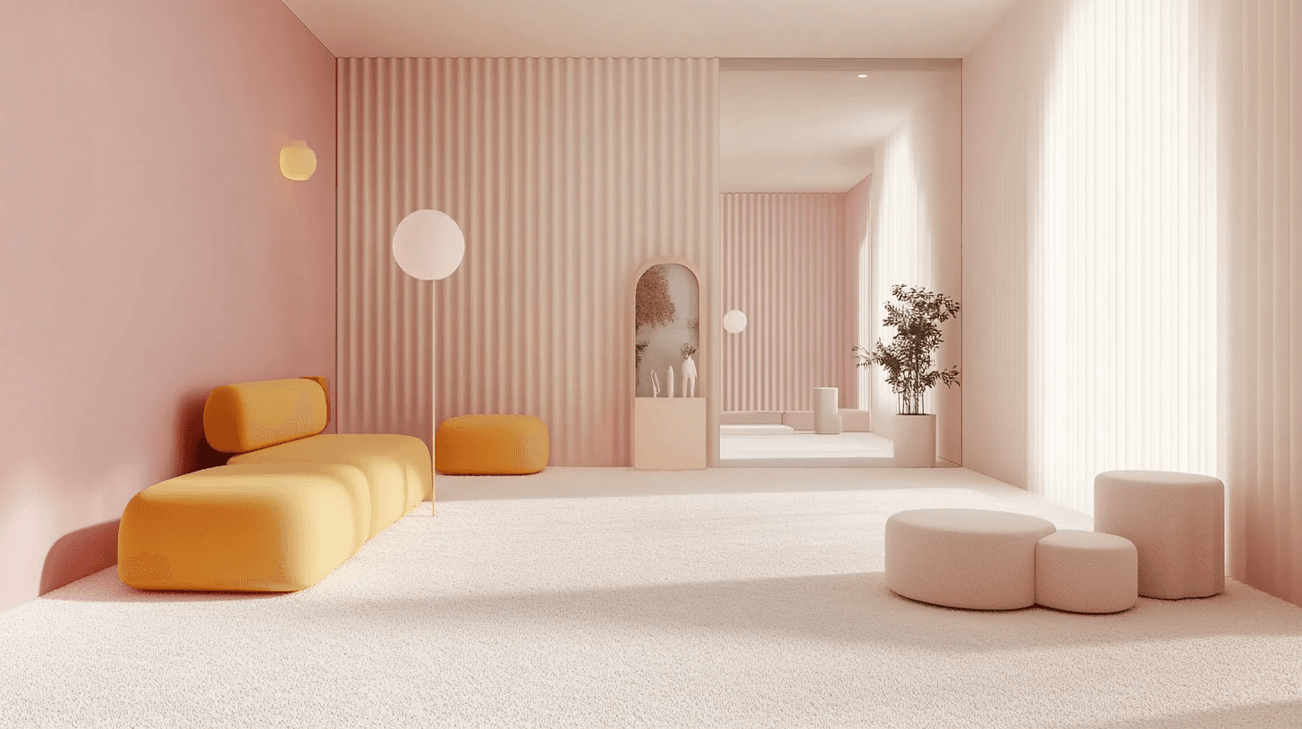
Mastering color in design
Color is a versatile element that shapes not only visual aesthetics but also user experience. Here’s how to harness its power across various design contexts:
01 Select Purposeful Colors
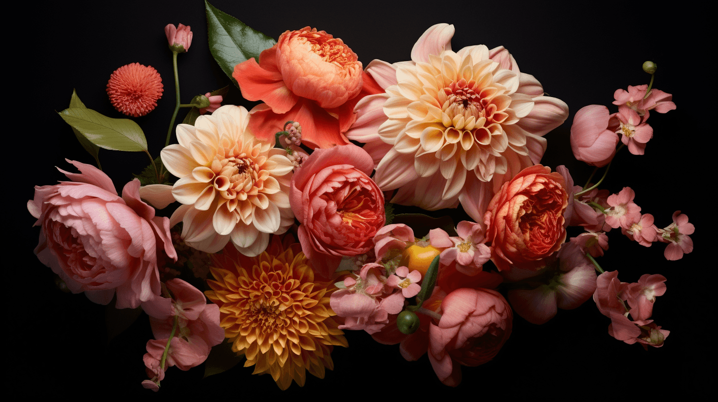
Choose colors that reflect your brand’s essence and purpose. Each color has psychological impacts—blue conveys trust, red stimulates excitement, and green promotes calm. Ensure your color choices align with the message you want to communicate.
02 Maintain Contrast and Readability
In all design mediums, from print to digital, contrast is crucial for readability. High contrast between text and background improves legibility, making information accessible to all users, including those with visual impairments.
03 Apply Color Strategically
Use color to direct attention and convey hierarchy. Highlight essential elements such as calls to action or key information to guide user interaction and focus on what’s important.
04 Achieve Visual Harmony
Create a cohesive look by using a harmonious color scheme. Whether through complementary or analogous colors, balance your design to create an appealing and unified visual experience.
05 Test Across Mediums
Colors can look different across various materials and screens. Test your color choices in different formats to ensure consistency and effectiveness, from printed materials to digital displays.
Mastering color in design involves more than choosing appealing hues; it’s about using color purposefully to enhance user experience and communication across all platforms.
SHARE ARTICLE